Spotify

I have been a Spotify member for 8+ years. It is probably my most used app and I have always loved the branding of the platform.
I have always noticed some issues with navigating on the now playing screen. So I decided to do a mockup to figure out a solution.

.png)
2.
1.
3
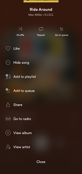
Figure 2 shows the menu button, which brings the user to the menu screen for the current song playing.
To get to the artist radio, it takes about 3 clicks
The goal for this layout is to make the following signifiers a priority on the now playing screen:
-Artist radio
-Artist Playlist
-View album
-Album name
Final
Now all the elements for my goal are in a region on the screen.
Reducing the amount of clicks will offer more engagement time. Having a signifier for the artist playlist is something Spotify should have had from the start.
made in Adobe XD